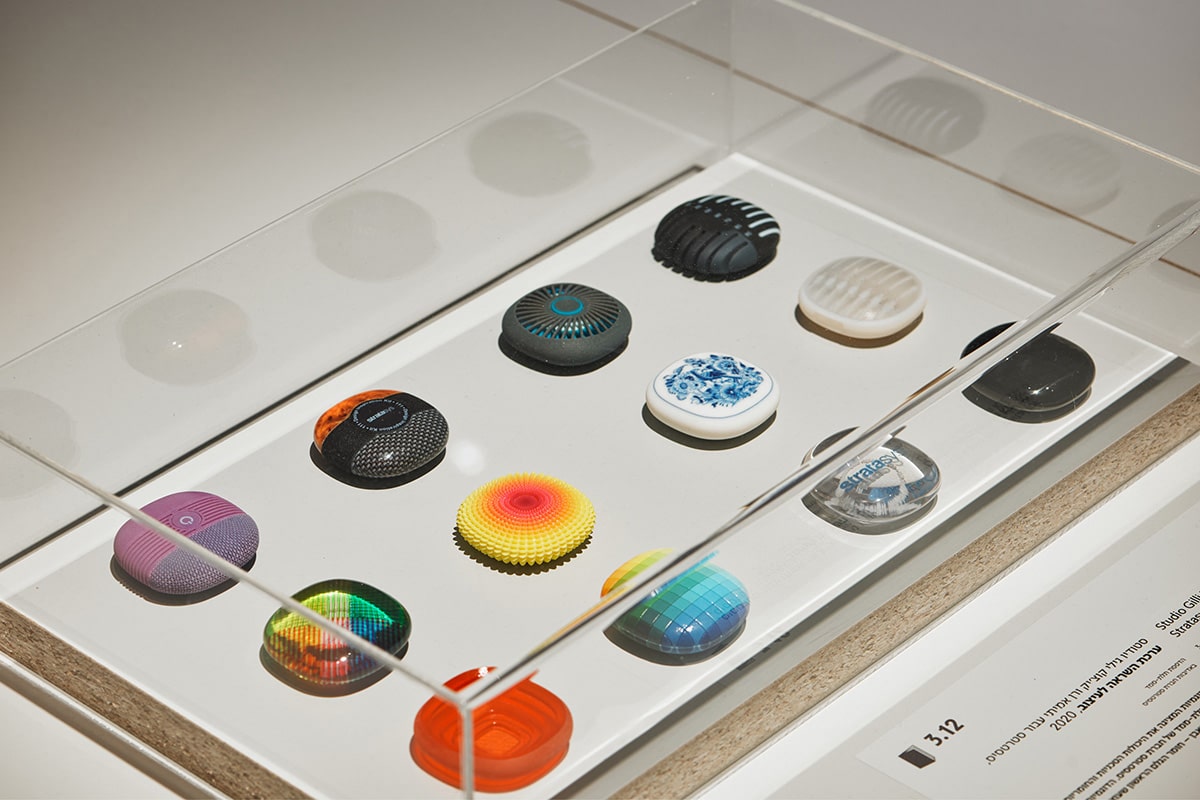
After working on a couple of sales kits sample products for Stratasys, we proposed a new kind of concept to the company.
Up until this project, the company’s sales kits were made up of a combination of products that are either lookalikes of existing product types (usually mass produced plastics) or technical samples made by the company’s engineers that showcased different aspects of the printer such different shores, color intensity and so on. The most inspiring samples were for us the technical samples that showcase the “raw” possibilities of the printer. But each of these samples looked completely different and couldn’t be combined into one coherent sales kit.
For this reason, we proposed to Stratasys to make a new sample kit that would showcase all the printers “raw” technical abilities but would create a coherent and aesthetic platform that would unite all these samples into one clear story.
Thinking of the idea of “raw” we thought of an iconic expression of this concept and reached the “rock”. The first raw material shaped by man. Exploring this idea further we thought of a fantasy story that each “rock” in our kit as a raw manifestation of abilities that is found in our Startasys made nature: A rock of colors, a rock for fine details, a rock of shore types and so on.
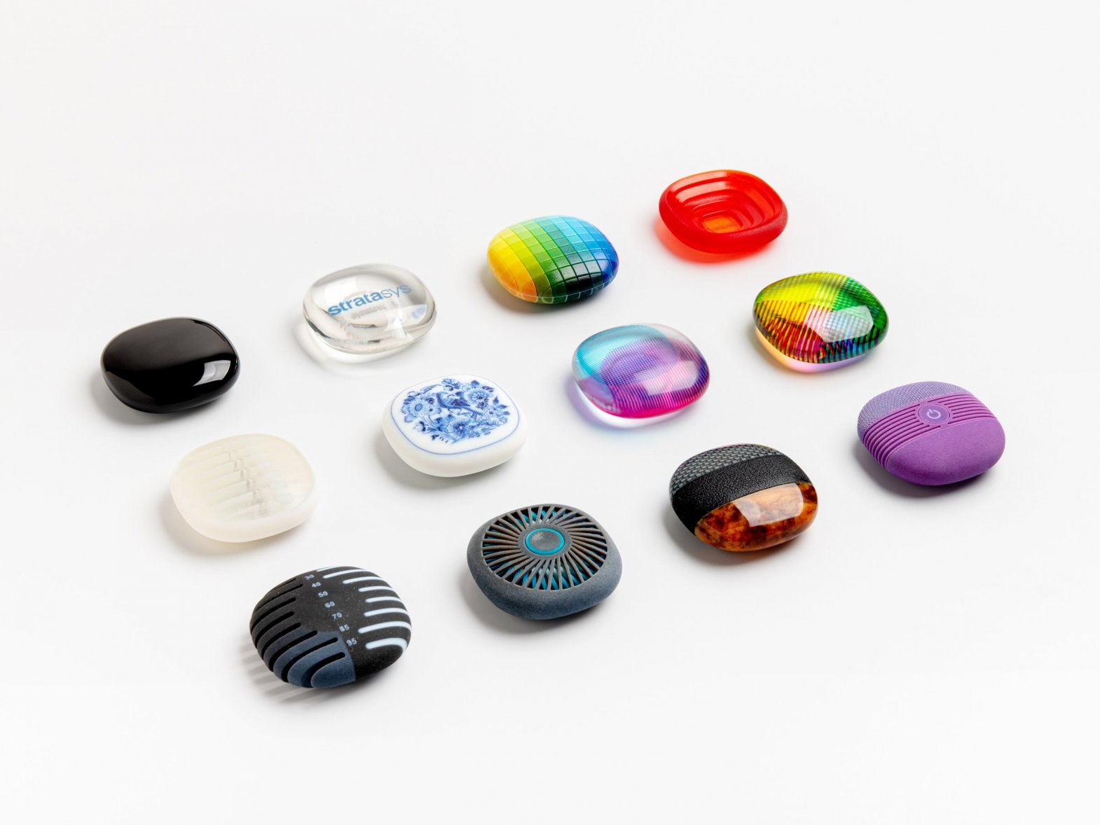
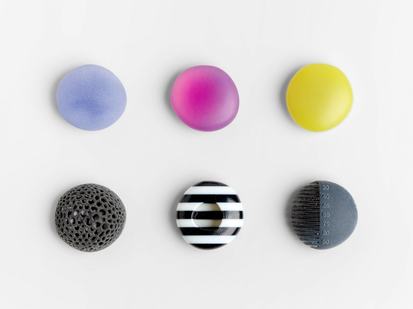
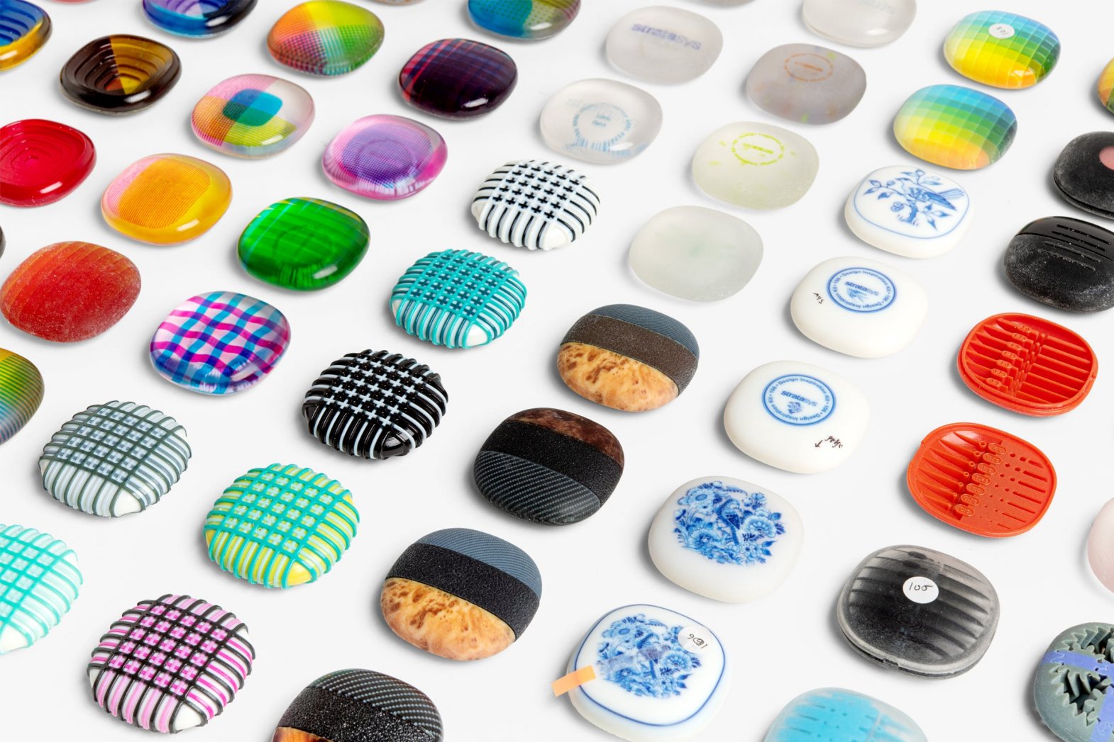
Refining this idea we came to the shape of a pebble as a soft, fun to hold shape. At first we worked with organic shaped pebbles which gradually became more geometric. Each of the pebbles was a design project of itself, that used the pebble shape as a starting point to work from to cut, shell, slice, split, color and so on.
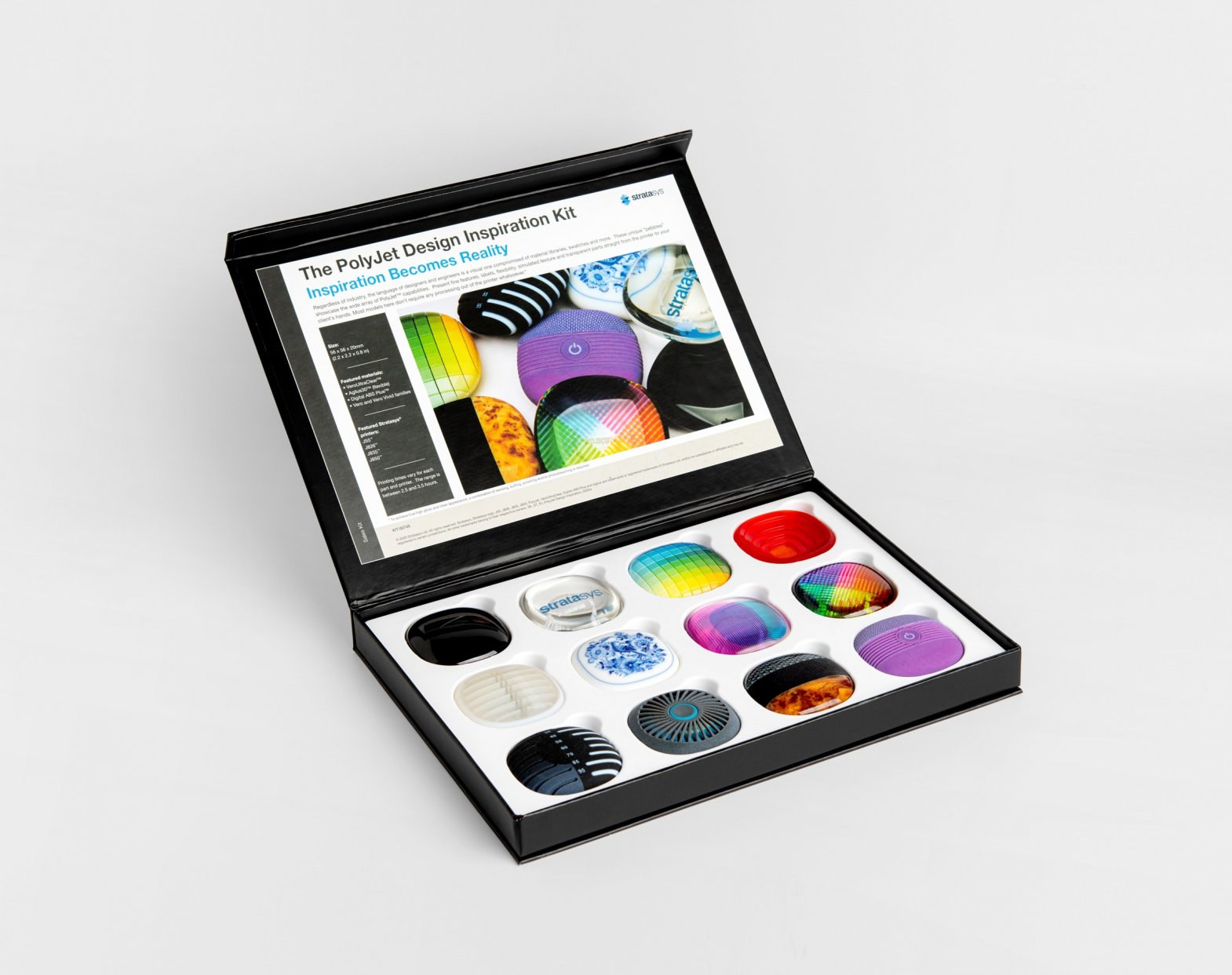
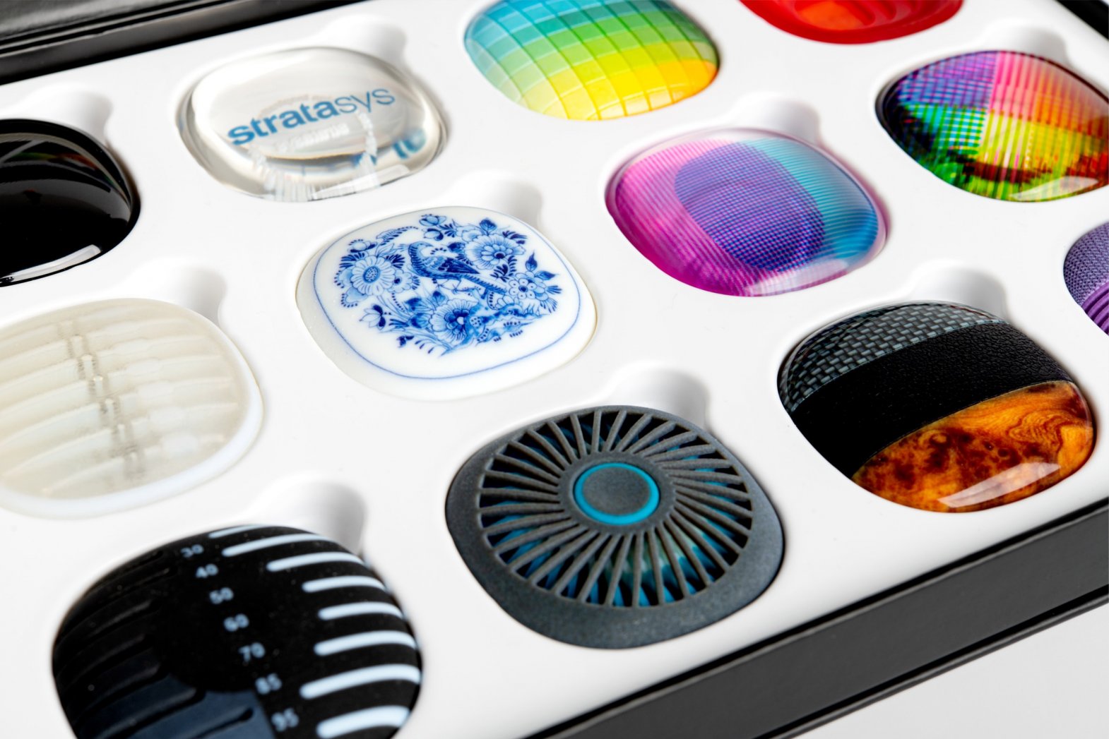
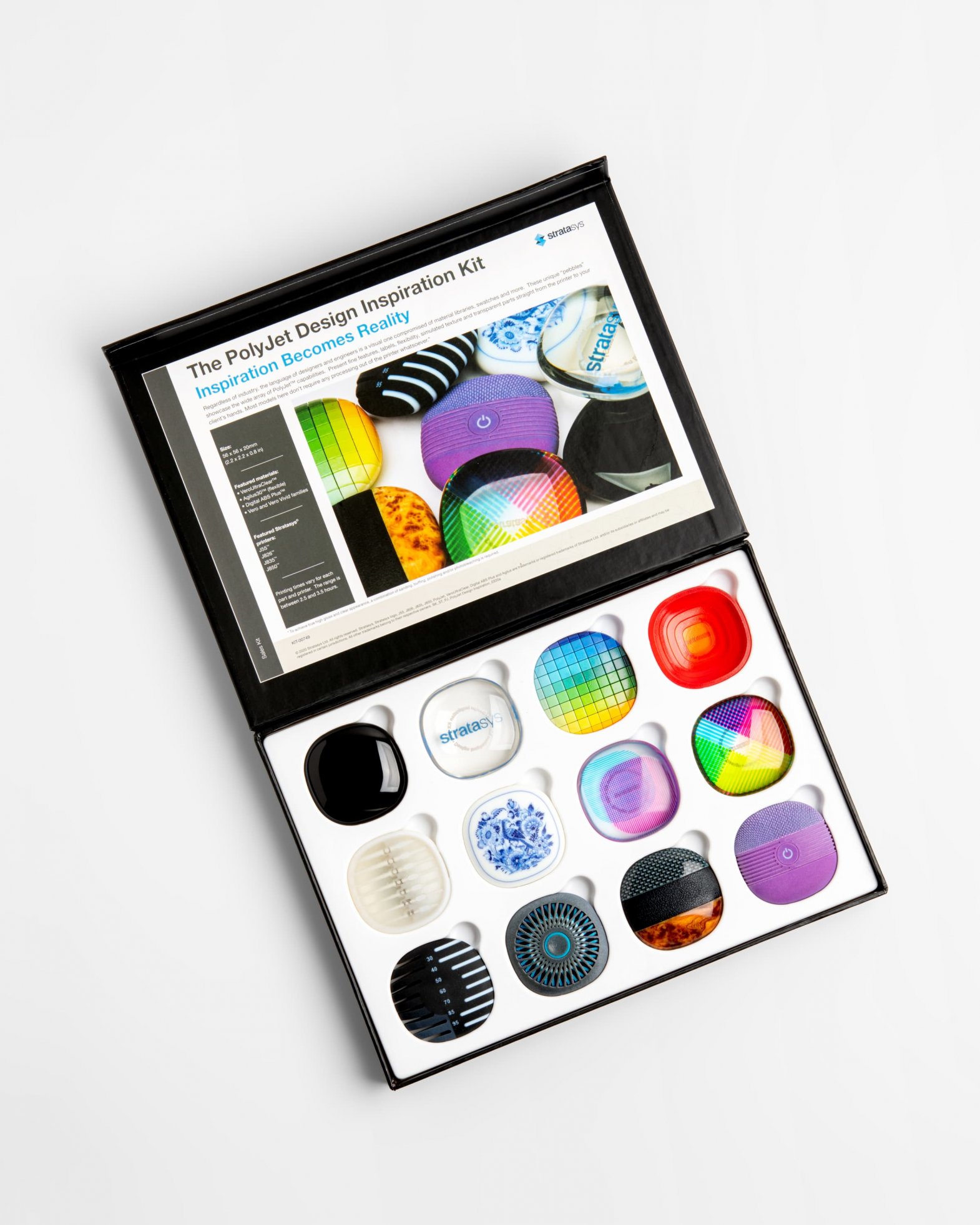
The result is a design inspiration kit that is made of 12 numbered pebbles that is also intended to serve as a platform for the company for years to come as they continue to expand the pebble collection to showcase to designers their printer’s abilities.
Thank you for Stratasys team for trusting us with such an abstract concept propositions and for the great collaboration.
Design Inspiration Kit on the 2021 Red Dot award.
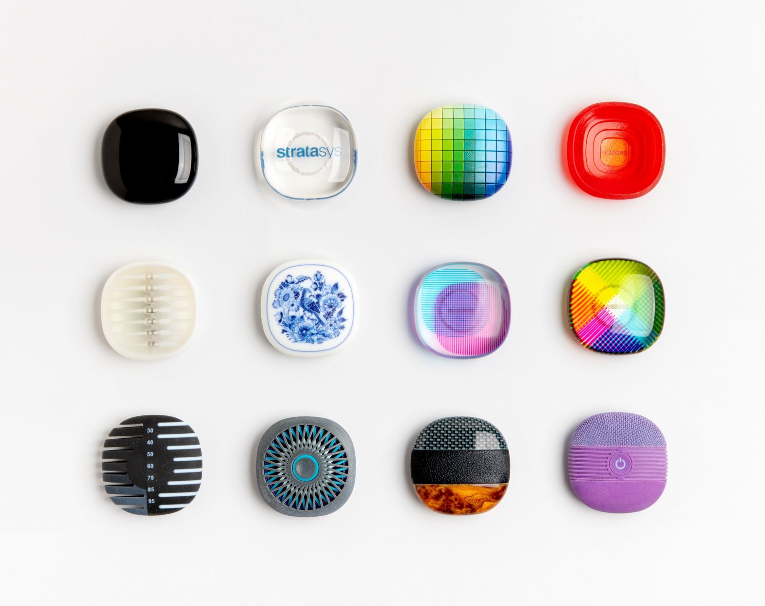
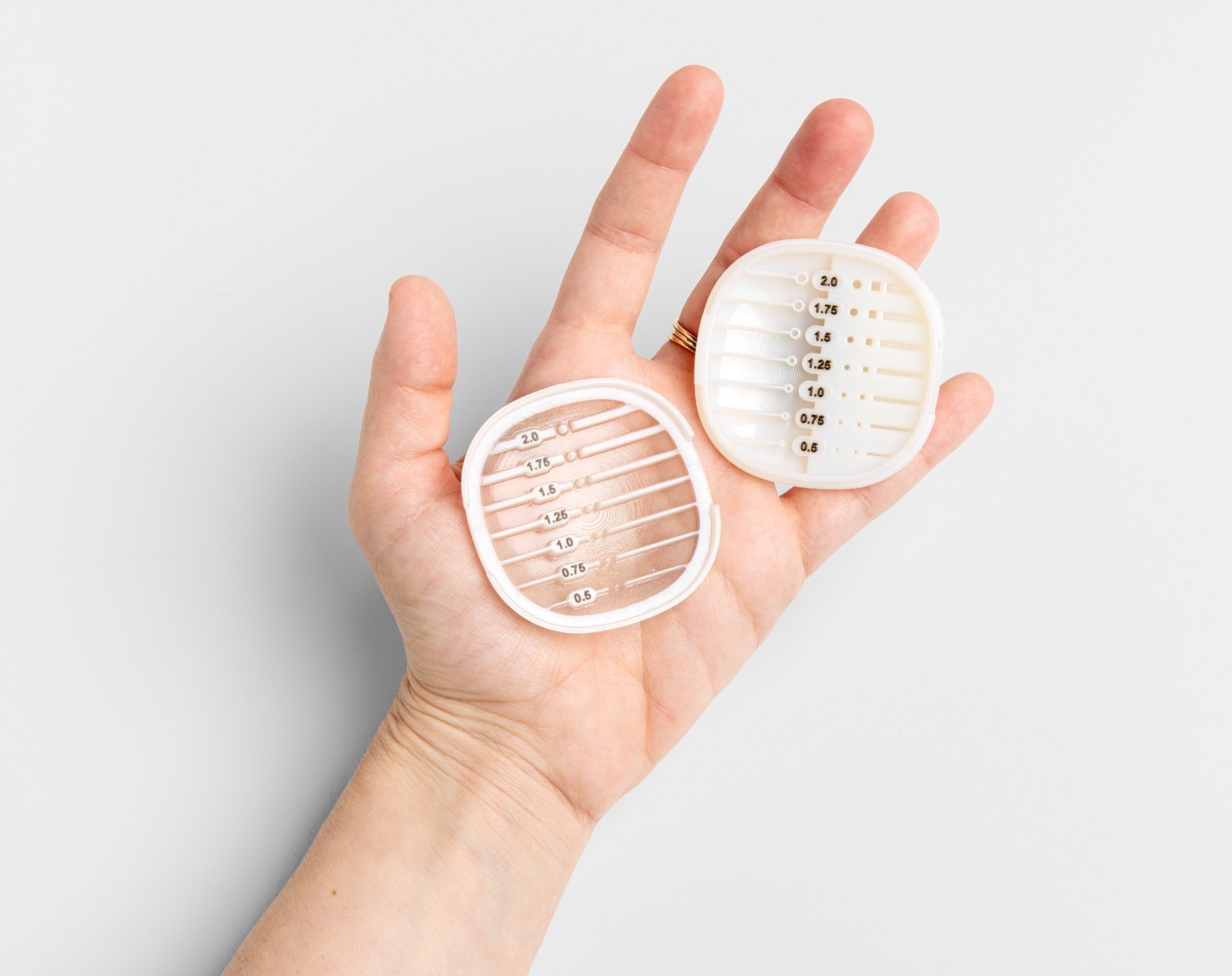
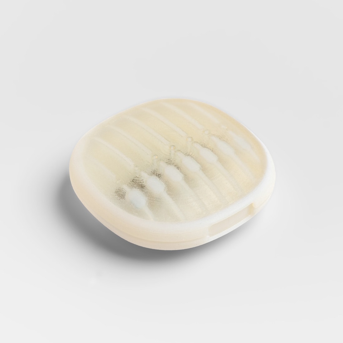
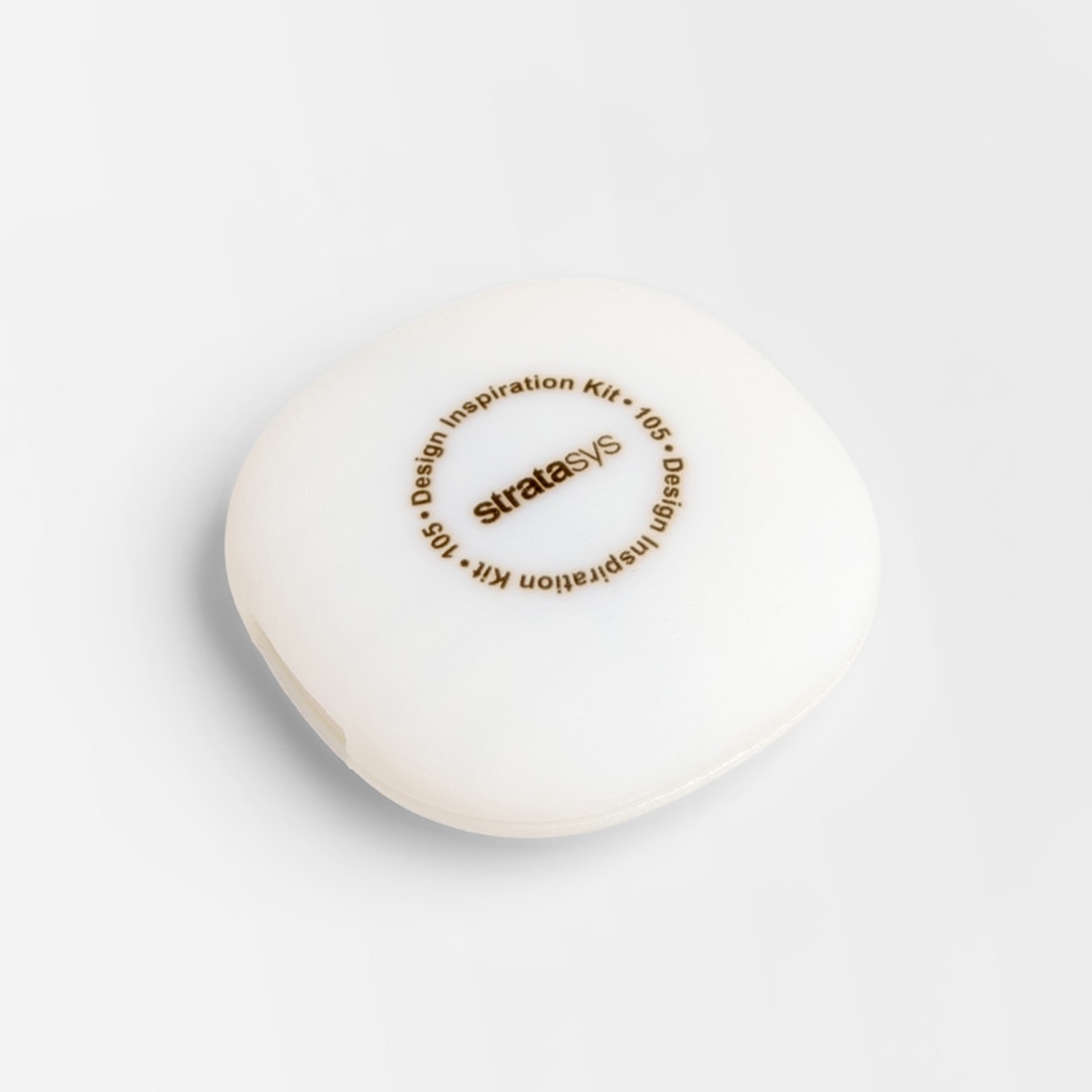
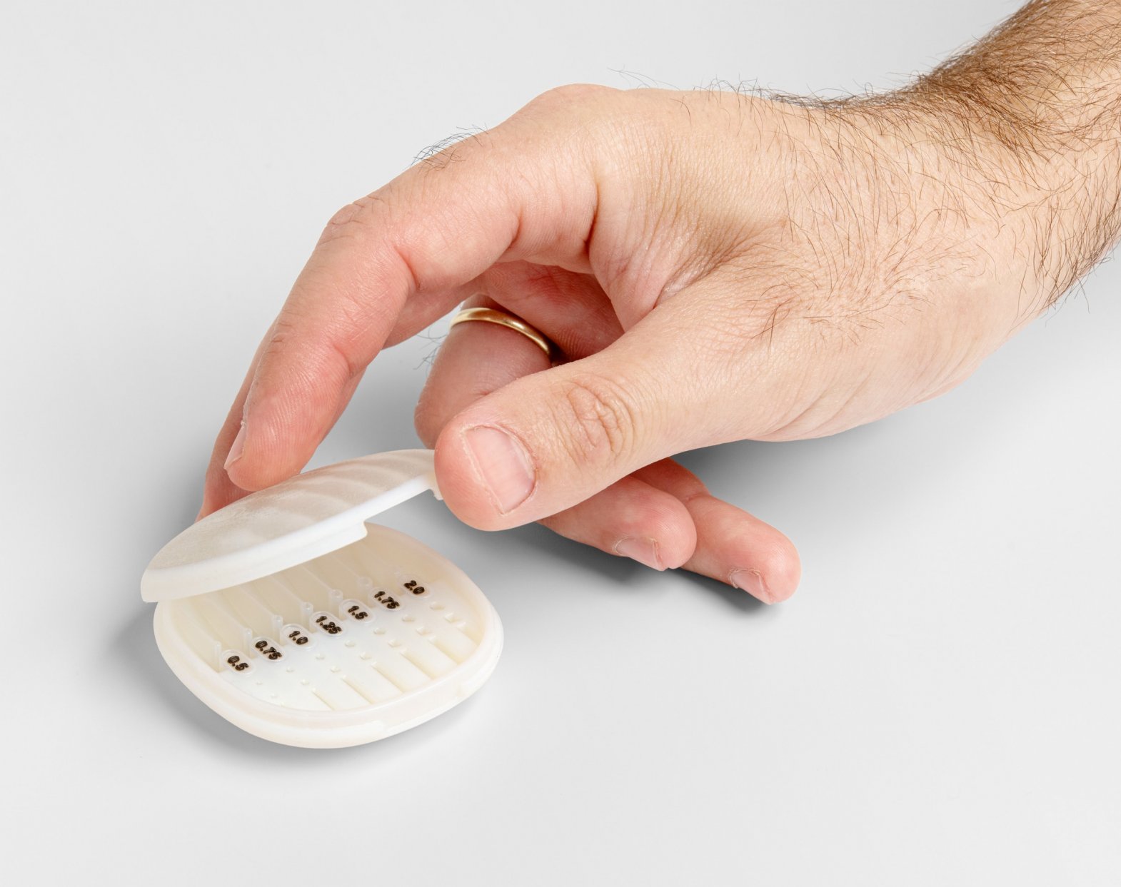
One of our favorite pebbles is pebble 105 which was nicknamed the “technical pebble”. One of the printing capabilities we wanted to showcase was the technical ability of printing extremely thin walls, bosses and holes. But this posed a problem as thin parts are fragile. Motivated by the need to protect these details we decided to use the pebble as a 2 part box, that upon opening reviles the fine details. When the box is closed the fragile details are safe and protected.
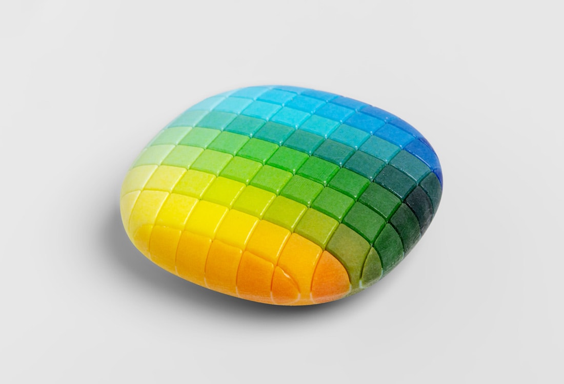
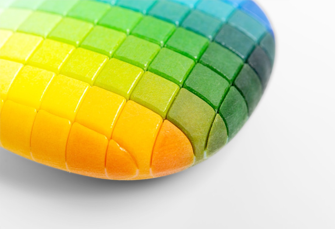
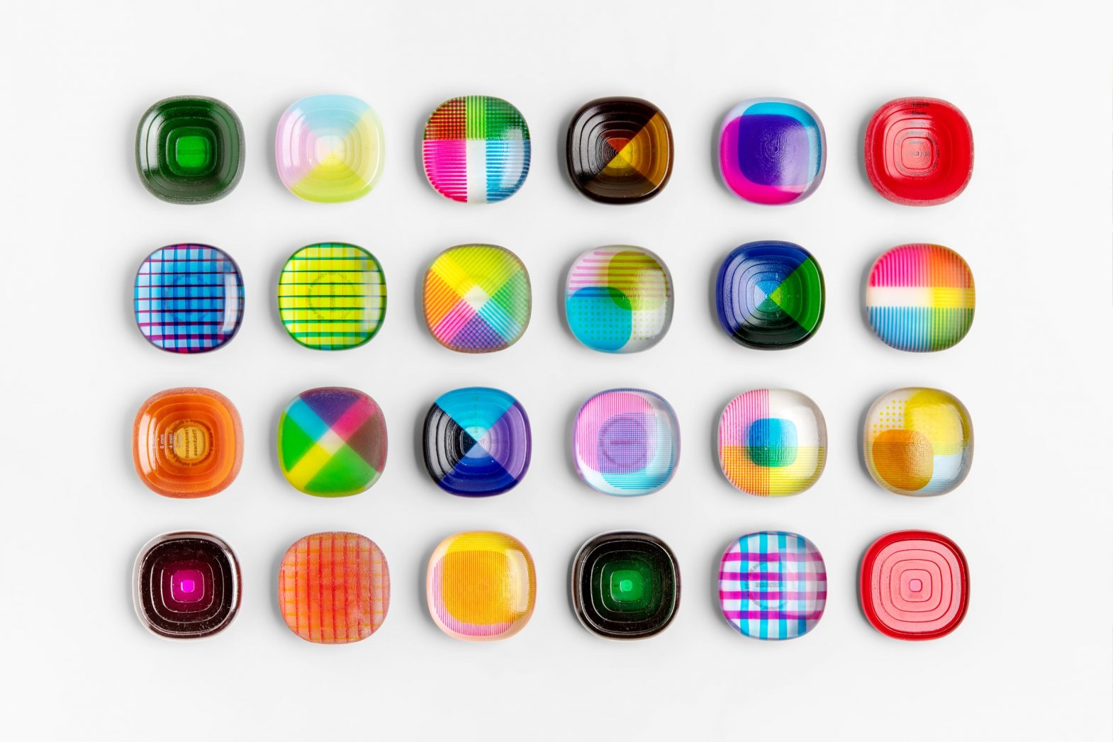
Pebble 103, which we nickname “the mango”, was dedicated mainly to color and more specifically the ability to use an endless combination of colors in one print. The colors can be specified by a variety of color systems including Pantone and CMYK. Additionally, we wanted to showcase in this pebble the ability to print very fine details such as thin cuts.
Another one of our favorite pebbles is pebble 104. The intention of this pebble was to show the effect of material thickness on the lightness/darkness of clear colors. At a certain point of the design process we thought to color this pebble in a few colors to show this effect across different color shades, but eventually decided to go with a cleaner one color pebble for this idea.
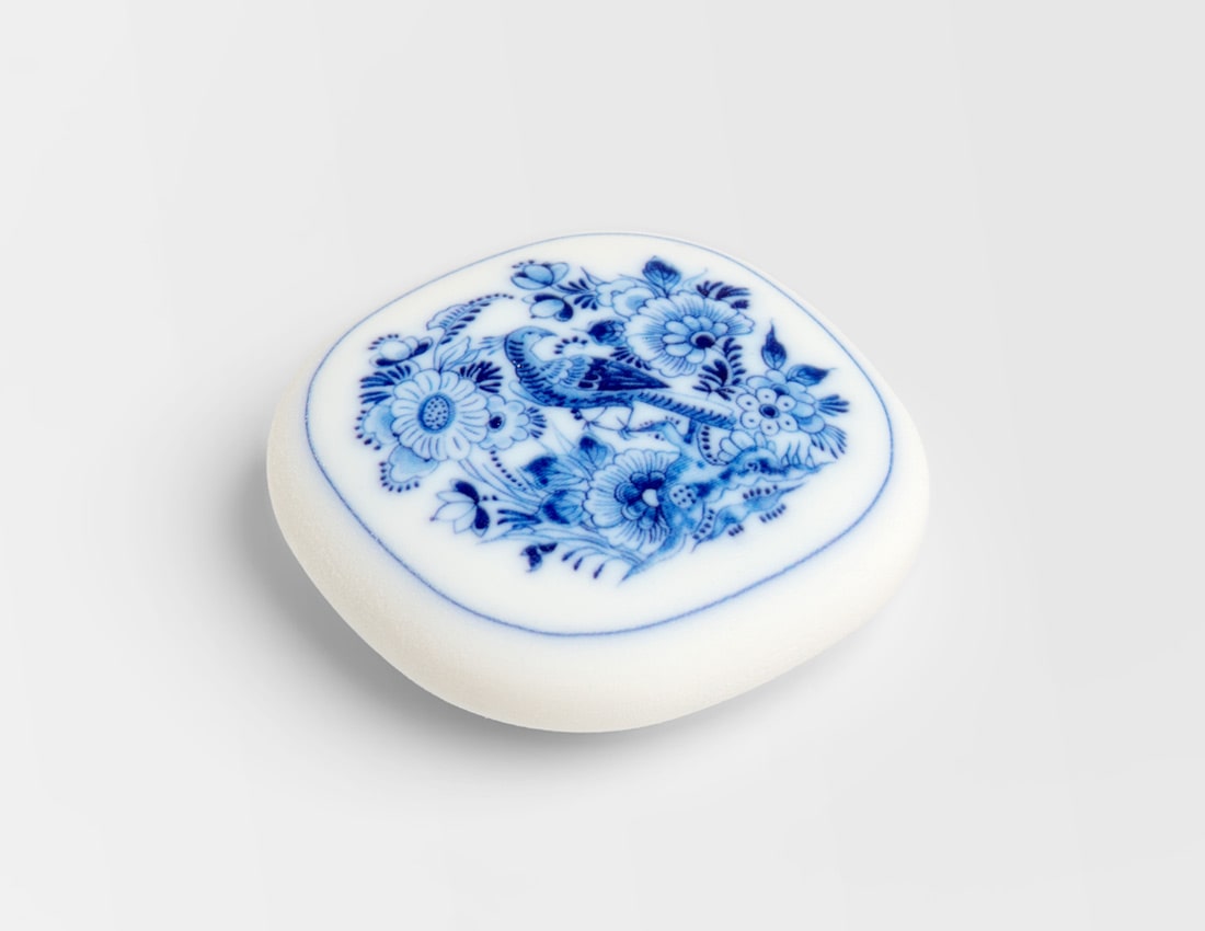
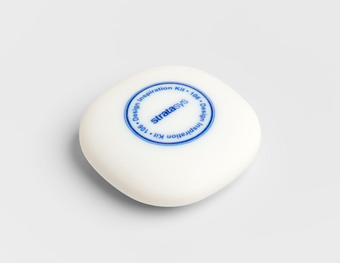
With pebble 106 our goal was to showcase the ability to print images. Because until this point, images were usually showcased in the Stratasys sales kit as digital screens, we wanted to employ a more low-tech approach to this feature. We decided to go with the idea of duplicating images from the ceramic world using decals, only that in our pebble the “decal” is applied digitally instead of physically.
This pebble did not actually make the final cut for the 12 final pebbles, but is still one of our favorites : ) The motivation of this pebble was to show what Stratasys nicknames “PJ (Poly Jet) Magic”, which is basically to show the “awesomeness” of the printers ability. For us, this magic is strongest in the ability to use clear and colored clear materials. To showcase this ability, we made a pebble which has a grid of thin inner walls, the vertical walls are magenta and the horizontal are cyan. When you move the pebble around the colors mix when they cross each other, and change from magenta, purple and cyan.
Our starting point for the project was in our inspiration from the collection of thousands of technical printing samples at Stratasys. Most of these samples were made by the company’s engineers for internal development purposes. But although these samples were beautiful, they were done by different people at different times and couldn’t be combined in a way that made sense. Understanding that these types of raw technical samples are what we are striving for, we set out to find a way to combine such samples into one clear story.
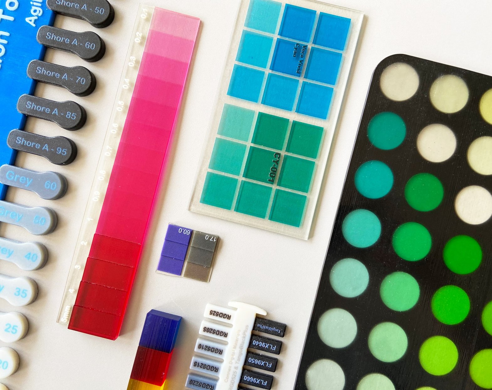
We worked in two directions. The first direction was what we called our “statue garden”. These were free of function three-dimensional thoughts that tried to understand what are the special abilities of the Stratasys Poly Jet printers and find a visual manifestation of them.
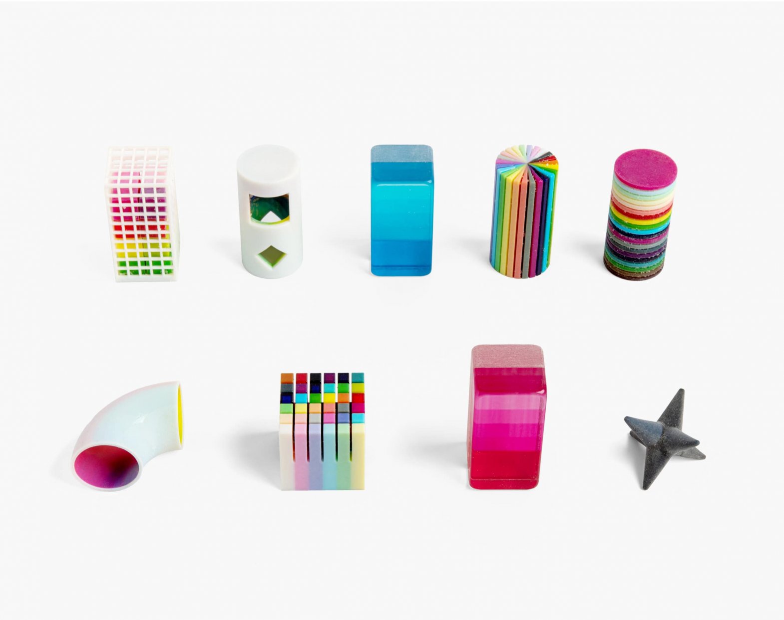
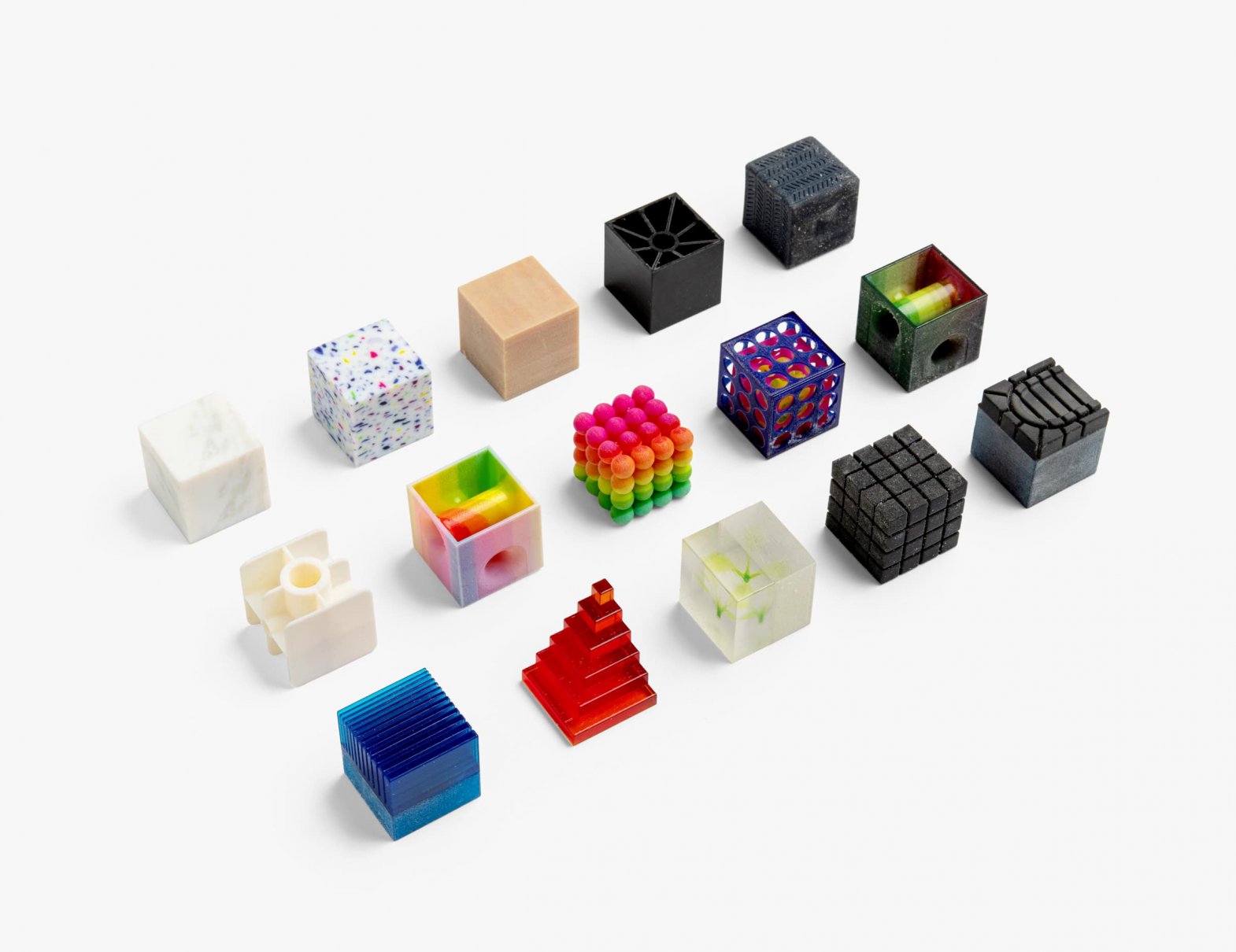
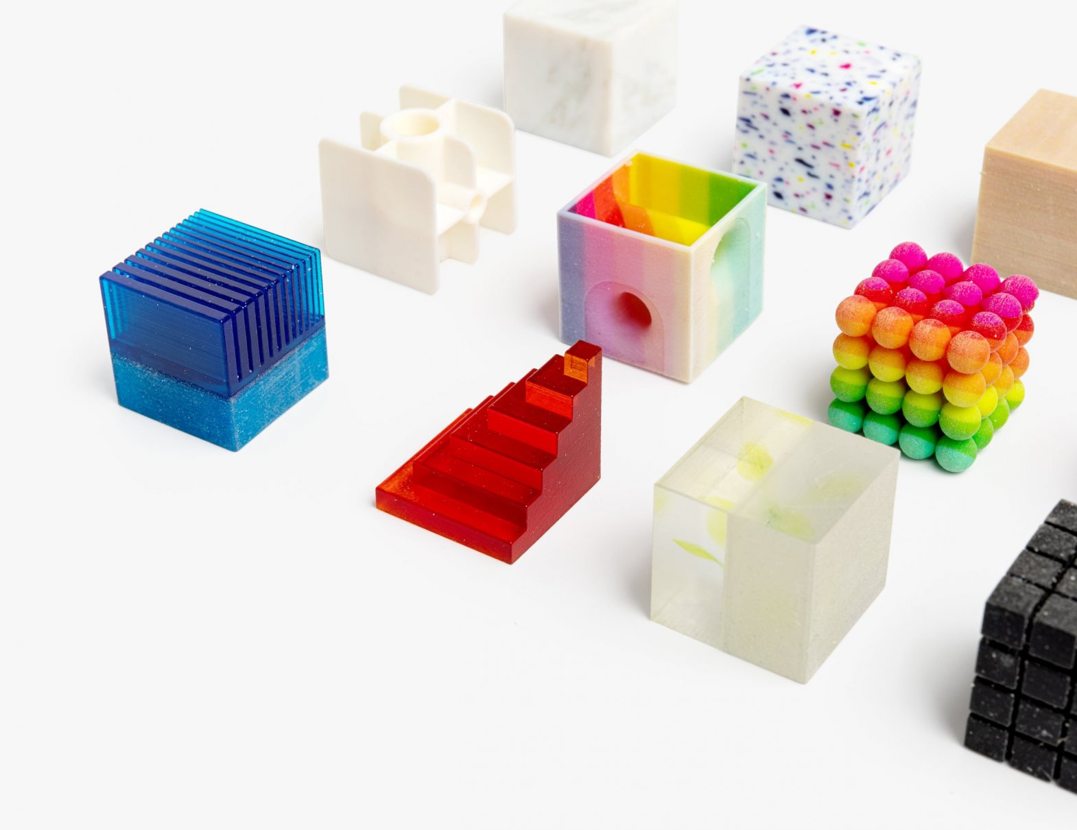
The second direction was to filter these three-dimensional thoughts through a funnel that found some common ground between these different “statues”. This first funnel, was of the chocolate box. We thought that the chocolate box is a good icon to use for this project as it invites the user to delightfully explore different tastes, textures and colors. We thought that this explorative tactile mind set was the perfect one for our sample kit. We evaluated this concept in square cubes, each one exploring one of the “statue garden” subjects. One of these translations was the “impossible to color statue” in which we colored inner cavities in complex color patterns that would not be possible to color by any other method other than 3d printing. But eventually the cube felt too confining and we moved on.
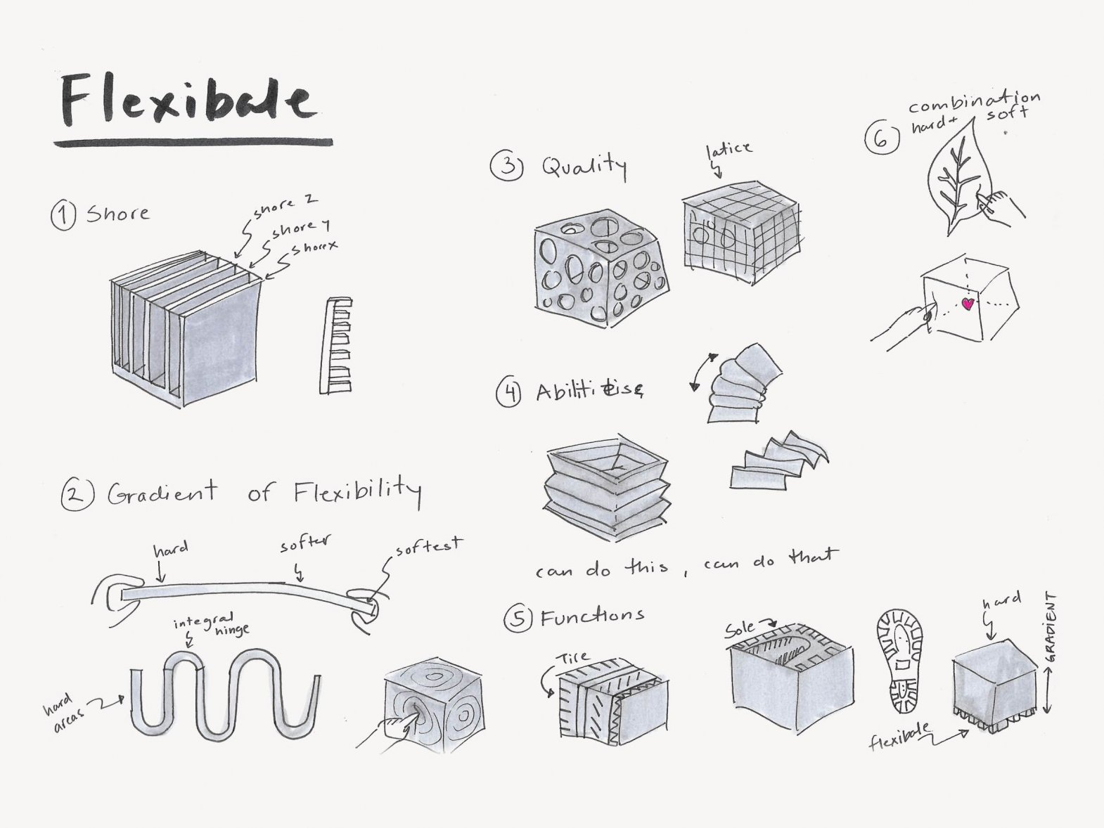
Sketches for the “flexibility” cube.
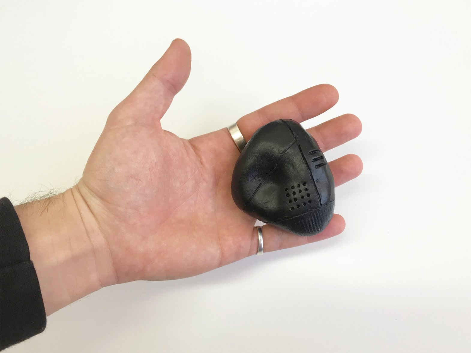
Maybe because we were backing away from a cube, we looked for a raw, organic shape that would be more strongly connected to our intentions. And we found it in the shape of a rock. This was the first model of this direction (made from painted clay), in which we imagined this surrealistic electronic rock which we “found” in our fantasy Stratasys made nature.
Refining this idea further we reached the shape of a pebble, due to its aesthetics and pleasant feel to the hand.
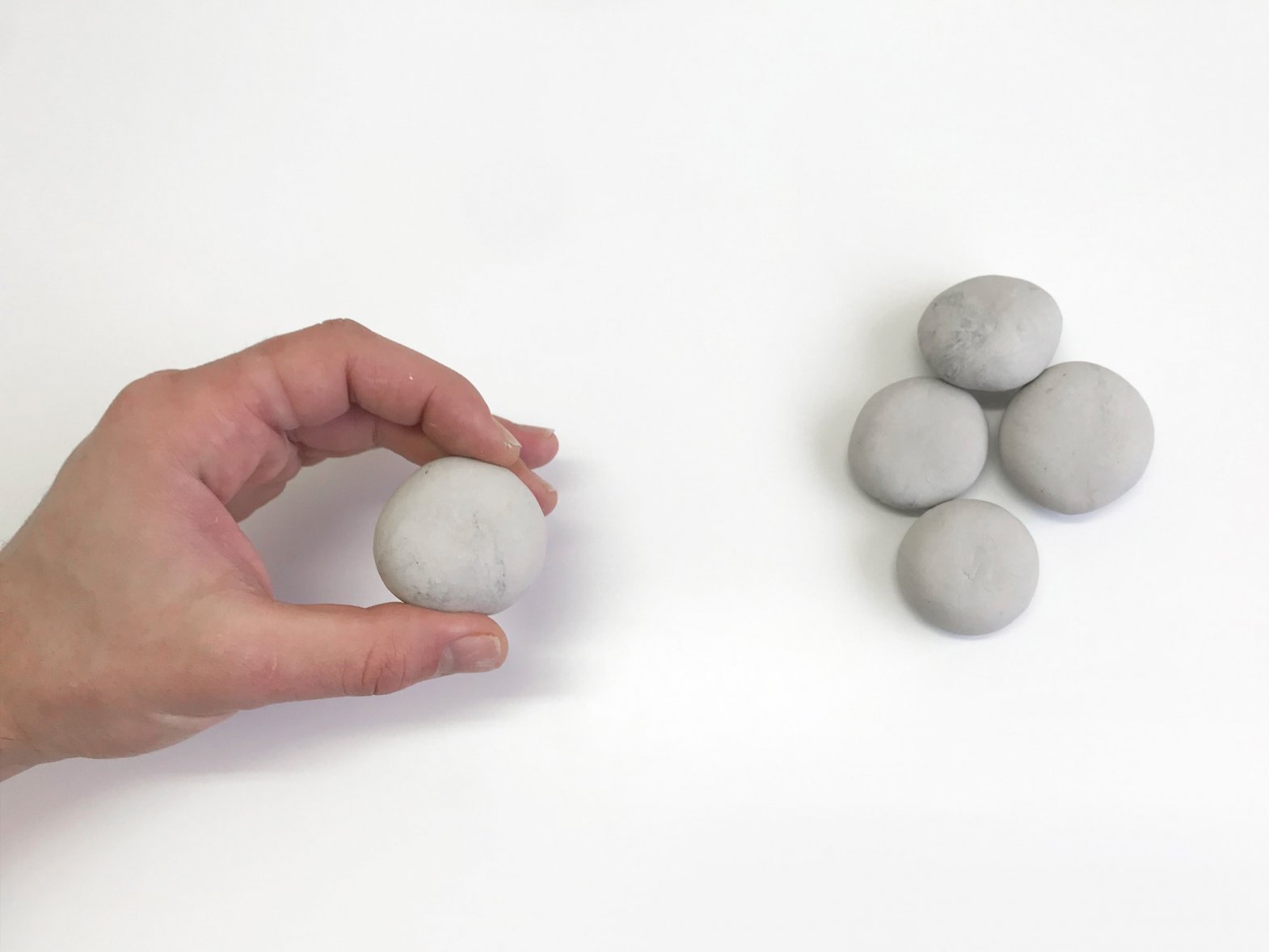
Having reached our base shape, we started to manipulate the pebbles according to the printing capability’s we wanted to showcase.
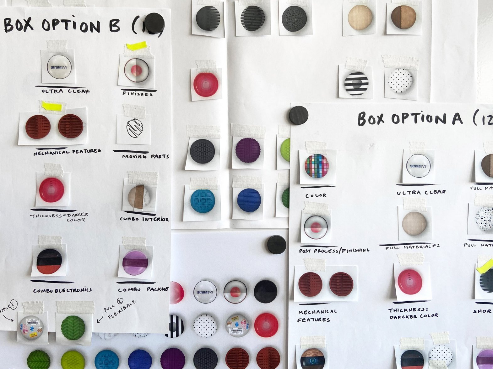
Having made dozens of pebbles, we started the selection process with a goal to reach 12 pebbles per kit. This would allow the pebbles to be large enough to hold comfortably and have a nice physical presence, but still fit in a A4 size box.
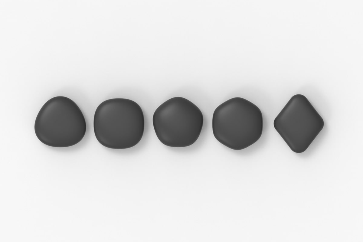
At this point in the project there was a somewhat of a concern that the organic looking pebble was too organic and there was a desire to “geometricize” it so it would look more intentional. We searched many shapes and finally decided on a square pebble.
Here are some of the process prints and tests.
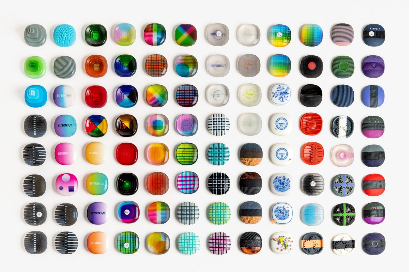
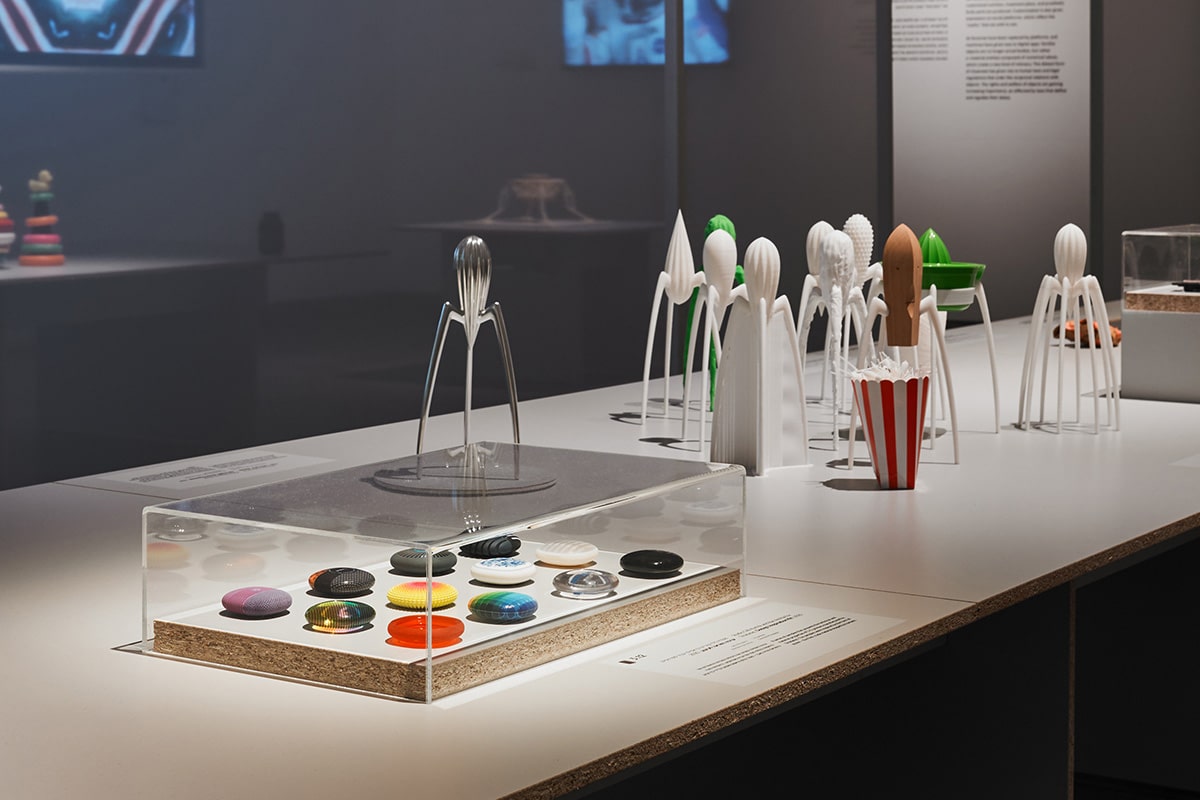
During 2021, Design Inspiration Kit designed was added to Design Museum Holon’s permanent collection. The kit was presented as part of the at the “Black Box” exhibition, which exhibited the museum’s collection.
